Checkbox & Radio
-
3
Notifications
-

Emay Walter liked your post
10 minutes ago -
Allie Gratershared your post
5 hours ago -

Colin Sikcommented on your post
yesterday - Check all
-
-
2

Jane Cooper
active
-
Hello.how are you?
-
I am facing js issue can you help me?
-
-
-
2
-


Wade Warren
UI DesignerDefault Checkbox
Use the .form-check-input and .form-check-label for checkbox.
Default Checks
Disabled Checks
Right Checks
Indeterminate
Custom Checkbox
Use the .form-check-input and .form-check-label for checkbox. And filled checkbox used .checkbox-solid-* and bordered checkbox used .checkbox-*.
Bordered Checkbox
Icon Checkbox
Filled Checkbox
Default Radio
Use the .form-check-input and .form-check-label for radios.
Custom Radios
Disabled Radios
Right Radios
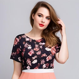
Images with Checkbox
Use the .form-check-input and .form-check-label for image checkbox.
Images with Radio
Use the .form-check-input and .form-check-label for image radio.
Custom
Checked Image
Disable Image
Disable Checked Image
Custom Radio
Use the .form-check-input and .form-check-label for radios.
Bordered Radio
Icons Radio
Filled Radio
Default Switches
Use the .form-switch and .form-check-label for switches.
Custom Switches
Disabled Switches
Right Switches
Inline Input-types
Group checkboxes or radios on the same horizontal row by adding .form-check-inline to any.form-check.
Inline Checkbox
Inline Radios
Inline Switches
Animated Buttons
Use the .radio_animated through animated checkbox and radios.
Select your payment method
Visa MasterCard Paypal G-pay BitpayWhat is your favorite social media?
Instagram Facebook Whatsapp TwitterBasic Radio and Checkbox
Use the .form-check-inline through display inline.
Simple Checkbox
Simple Radios
Radio Toggle Buttons
The choice between these two approaches will depend on the type of toggle you are creating, and whether or not the toggle will make sense to users when announced as a checkbox or as an actual button. [any one selected].
Outlined Checkbox Styles
The choice between these two approaches will depend on the type of toggle you are creating, and whether or not the toggle will make sense to users when announced as a checkbox or as an actual button. [multiple selected].